































What the screen resolution test shows
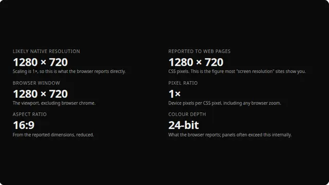
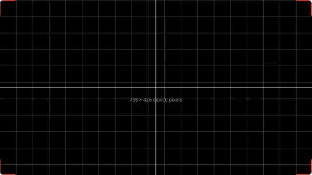
Web pages are told the screen size in CSS pixels, not physical ones. On any scaled display those are not the same: a 3840 × 2160 monitor running at 200% scaling reports 1920 × 1080, and every site that shows you one number and calls it your screen resolution is showing you that one.
Multiplying by the device pixel ratio usually recovers the real figure, and that is what the first number here does. It is not guaranteed — fractional scaling and browser zoom both change the ratio — which is why both numbers are shown and labelled.
Reading the numbers
The likely native resolution is CSS pixels multiplied by the pixel ratio, which is the panel’s real resolution on most setups. The reported figure is what web pages actually receive. The window size is your browser viewport, which is what a responsive layout responds to.
Change your browser zoom and watch the pixel ratio move: zoom is included in that figure, which is exactly why the derived native resolution can be wrong if you are zoomed in.
What this test cannot tell you
The browser cannot read your monitor’s specification. Everything here is derived from what the operating system reports to the page, filtered through scaling and zoom — so treat the native figure as a well-reasoned inference, not a fact.